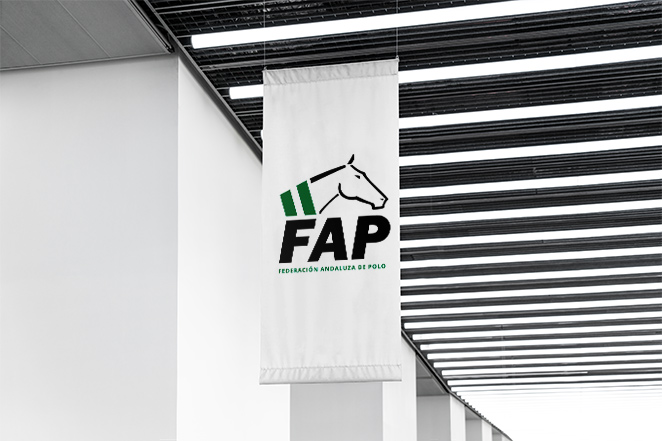
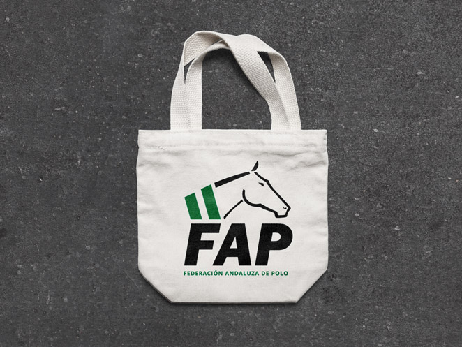
Logo redesign for FAPOLO
The Andalusian Polo Federation (FAPOLO) is a regular customer in our company: every year, when the season begins, we manage their social networks and the website.
For this reason, they trust us to update their corporate image and adapt to new technologies: with a more visual logo that quickly reflects everything they want to convey, easy to remember and endearing.
We use the green stripes to represent the Andalusian flag, rescuing this element from the original logo. The horseshoe is replaced by a mare’s head, and a legible cut stick typeface is used, with the meaning of the initials under the logo.